Latest posts
-
How to Structure Your Website for AI-Driven Search (Like SGE and ChatGPT Plugins)
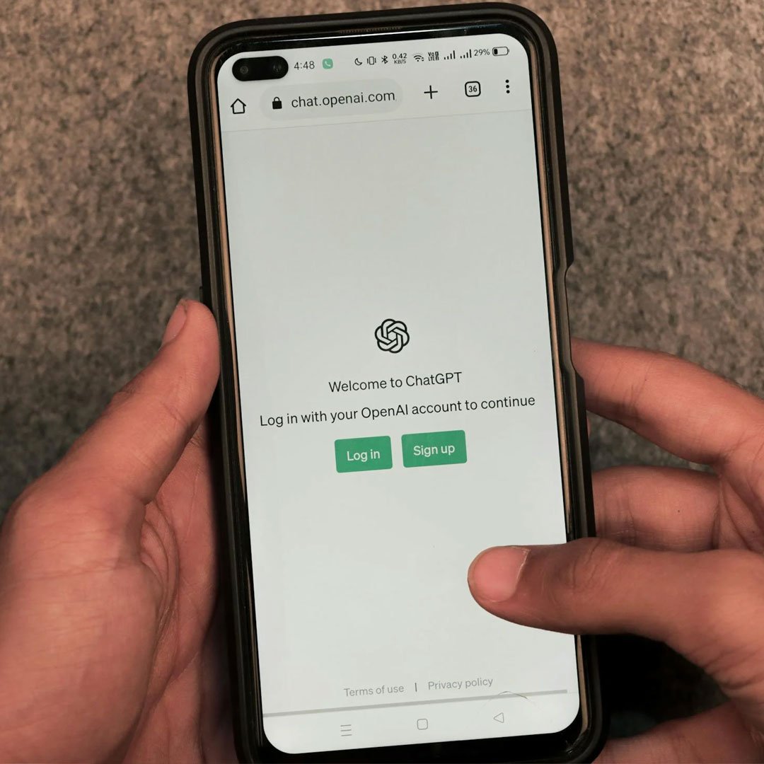
AI is changing how search engines—and users—consume content. This article shows how to structure your site so it’s easy for both algorithms and humans to understand and surface.
-
How to Future-Proof Your UX with System-Based Typography and Fluid Spacing

Design that holds up across screen sizes starts with smart systems. Learn how to build a UX foundation using modular type scales and spacing tokens that keep things responsive and readable.
-
The Imperfect Human Element: Why I Stopped Designing for the Best-Case Scenario

Ideal users don’t exist. This post shares what happens when we stop designing for best-case scenarios and instead build for the quirks, flaws, and unpredictability of real people.
-
How to Create Accessible Focus States for Keyboard and Screen Reader Users

If users can’t see where they are on the page, they can’t use it. This guide helps developers create focus states that work visually and functionally for all users.
-
Cognitive Load and UX: Why Too Many Choices Make Website Users Bounce

When users think too hard, they leave. Learn how to reduce decision fatigue in your digital experiences using behavioral science-backed UX principles.
-
Going Headless: The Future of High-Performance, Secure Websites

Headless websites are gaining traction for good reason. They’re faster, more secure, and more flexible than traditional CMS setups. Here’s what headless means, how it works, and whether it’s right for your next digital build.
-
Fixing Text Widows in Responsive Design: A jQuery Solution

Text widows can make even great designs feel sloppy. This quick tutorial shows how to prevent them with jQuery so your headlines look clean across devices.
-
How to Dynamically Adjust Font Size Based on Viewport with CSS and JavaScript

Tiny text on mobile, jumbo headers on desktop—typography should flex. This post shows how to scale fonts fluidly so your design feels balanced and accessible everywhere.
-
The 5-Second Rule: How to Make Users Stay on Your Website

Your homepage has five seconds to prove its worth. This post explains how to capture attention fast with clear messaging, strong visuals, and intuitive layout design.
-
Optimizing for the Thumb Zone: Mobile UX Design for Real-World Use

Thumbs drive mobile behavior. This article shows how to position buttons, menus, and key interactions within reach—so users don’t fumble, scroll awkwardly, or bounce.